TR&L
Lifting Standards, Elevating Safety
Teesside Rigging and Lifting – internally known as TR&L – is a leading training centre in the heart of Teesside, Northeast England. Covering a vast 7,500 square feet, they offer a comprehensive range of accredited rigging, lifting, and health and safety courses, catering to both onshore and offshore industries.
SERVICES: LOGO DESIGN + BRAND IDENTITY
THE CHALLENGE
With ambitions to expand beyond their Teesside base to destinations as far afield as the Middle East, TR&L needed a brand refresh that would resonate industry-wide.
Design by Ant partnered with a Harrogate-based business consultancy, which tasked us with revitalising the Tesside Rigging and Lifting brand that had begun to feel outdated and a little lost – the aim was to re-align the new brand with TR&L’s forward-looking vision.


THE SOLUTION
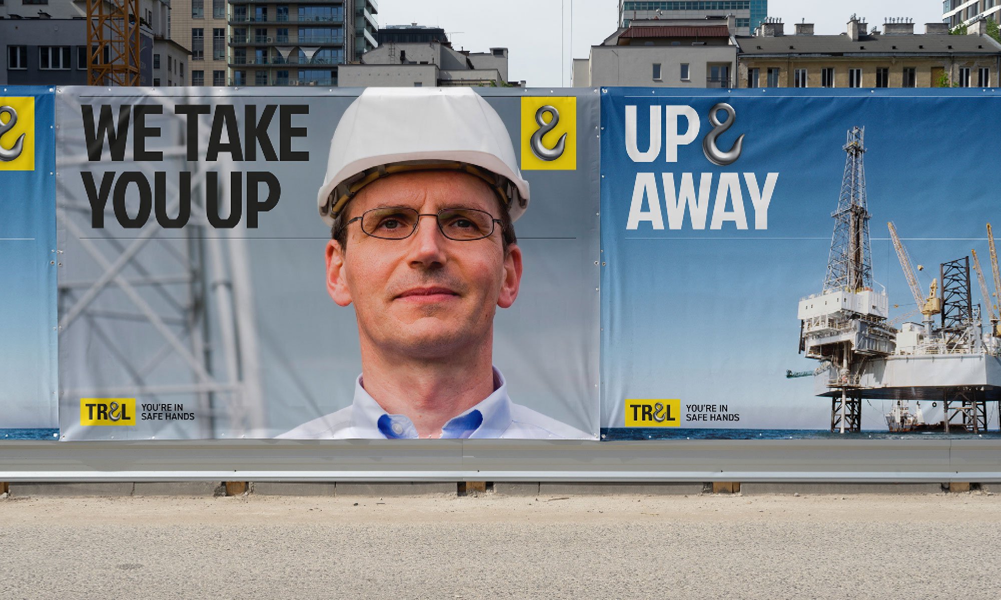
Design by Ant’s approach was to make the brand instantly recognisable and impactful. We noticed the existing logo featured an ampersand resembling a hook – an element we knew had untapped potential. By bringing this ‘hook’ to the forefront, we created a dynamic visual identity that became integral to the TR&L brand.
The colour palette of bold yellow vs black wasn’t just eye-catching; it was a natural fit. These colours are synonymous with safety and construction, they also reflect the key equipment used at TR&L’s main training site. The perfect choice for reinforcing TR&L’s brand identity.
We also played on the ‘hook’ motif by cleverly integrating it into the brand’s messaging – repeating it in phrases like ‘Safe & Sound’, ‘Above & Beyond’ and ‘High & Mighty’ gave TR&L a confident voice that spoke directly to their core training offerings.
To support the proposed business expansion, Design by Ant suggested a phased rebranding approach. While TR&L was already a familiar acronym among existing clients, evolving the brand to emphasise this name made sense. It allowed the company to step beyond the confines of Teesside and cater to a global market. Plus, it rolls off the tongue a lot easier.
The rebrand also introduced a new strapline: ‘You’re in Safe Hands’, capturing TR&L’s commitment to safety and excellence.